

Clear Corretora, XP Inc.
Clear Corretora App
Project scope
- Research
- Business rules mapping
- Stakeholder interviews
- New component design
- UX/UI design
- Usability testing
Introduction
Every brokerage app settles the conflict between beginner and trader with an advanced-mode button. We removed the button and let the investor profile decide what appears on screen.
- Company
- Clear Corretora, XP Inc.
- Period
- 2020 to 2021

An award-winning app
Live from 2020 to 2024. Three awards in the 2021 Guia Yubb, including best investment app and best trading platform, voted for by 110,514 investors. 719 thousand active clients in December 2020, three months after launch. Two years later, the app was rebuilt in another technology using almost 100% of the components from the design system I helped found.
-
Guia Yubb 2021
Best investment app
-
Guia Yubb 2021
Best trading
platform -
Votes
110,514 unique
votes

Two audiences,
one screen
In 2018 Clear became the first brokerage in Brazil to cut brokerage fees, the charge on every buy or sell, to zero. Its client base doubled. Alongside the usual traders came people buying their first share on their phone.
The two cancel each other out. Price-triggered orders and the order book scare people who are just starting out. An app that is too simple loses the trader, who had always been Clear’s reason to exist. The group put 18 months and R$ 10.5 million into a new app and platform, and the app had to serve both without asking anyone to pick a mode.
Beginner
- Buy shares
- Track investments
- Learn at your own pace
- Simplicity
Conservative profile
Trader
- Futures market
- Advanced charts
- Order book
- Orders and triggers
Aggressive profile
Who decides what appears on screen?
The previous app answered with modes. People picked one from the menu and the screen title reminded them where they were, as in "Swing Trade". That fails on both sides: a beginner who switches mode out of curiosity finds a trailing stop order without knowing what it does, and someone who trades every day spends their life switching modes.


Previous app 2018 to 2019
We handed the decision to the investor profile, the questionnaire that measures how much risk a client is willing to take.
Anyone classed as conservative buys and sells at the current price or at a price they set. Anyone classed as moderate or aggressive finds triggered orders, full charts and the order book without having to look for them.


What did that decision change in the app?
-
One search
One field, at the top, across the whole app. People who know the name type it, people who don’t browse the lists, and coming back from search they find their filters where they left them.
-
The main menu
Home, Invest, Orders, My Assets and Account have the menu. Inside an asset or an order it goes away, and the whole screen is left for the decision at hand.
-
Controls in context
Closing and reversing a position only exist for people who hold that stock. It came straight from a finding in the client tests.
-
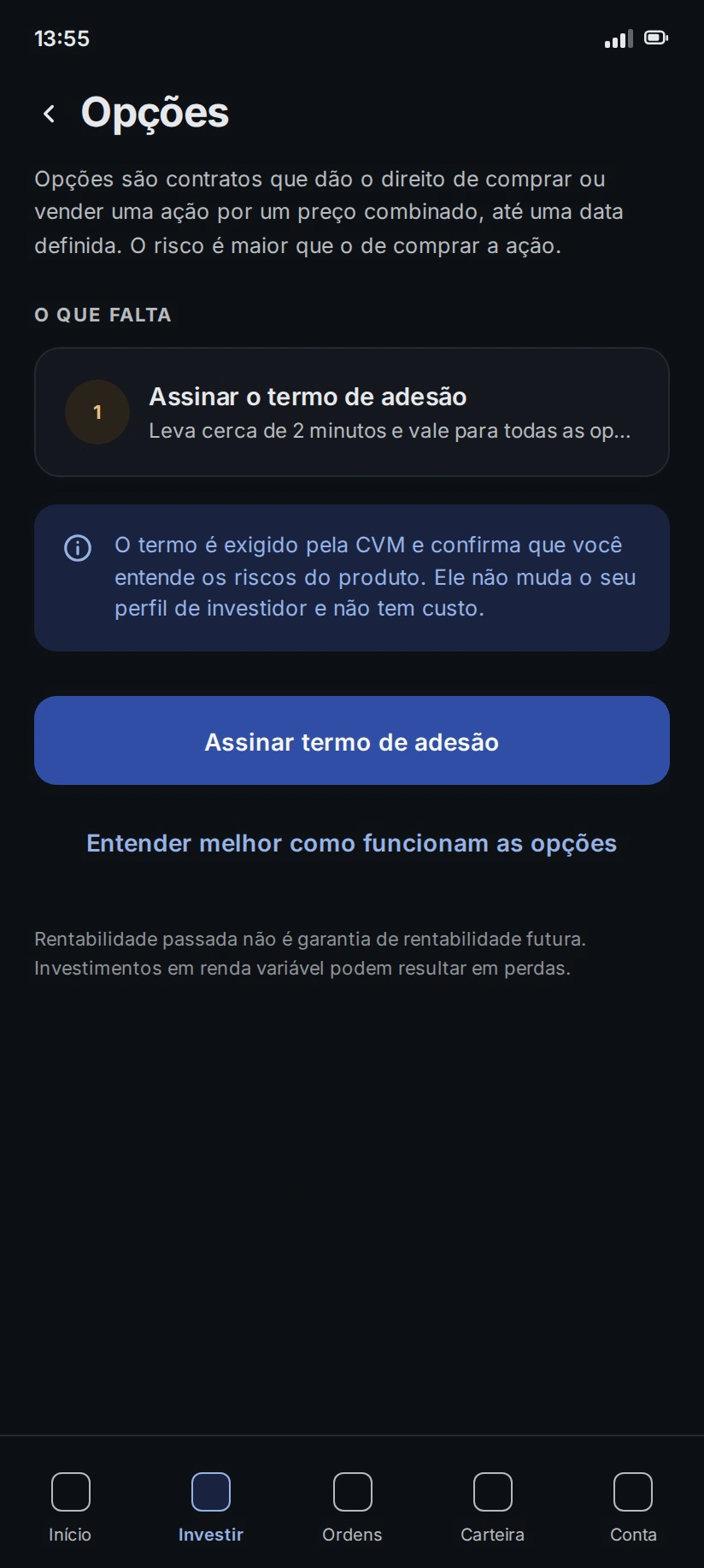
Product above the profile
The app shows a warning and asks for confirmation, as the CVM, Brazil’s securities regulator, requires. The purchase is still possible, because blocking it would be deciding for the person.
-
One order ticket at a time
Buying at the current price asks for the quantity and nothing else. Choosing the price adds the fields for that order type, and they appear the moment they start to make sense.
-
Every order has a home
Open and closed orders sit in separate tabs, with the count in the label. An order filled halfway shows as partial, with how much has gone through and how much is left.
Trade-offs with AI and what was turned down
Between 2025 and 2026 I went back to the app to refine flows and usability, discussing every screen with Claude, Anthropic’s AI. The two moments that improved the product most were the ones where the suggestion didn’t make it.
Refusal 1: The ready-made list
For the empty search, the suggestion was to show the most traded shares of the day. For a beginner that says as little as a list of top gainers, and both push a product choice dressed up as information. Search now shows only what belongs to the person: what they viewed and what they favourited.


Refusal 2: The rejected grey
For secondary text, the suggestion brought a grey that failed the contrast test. I swapped it for the one the interface already used, at 9.21:1 on the card background, above the 7:1 that WCAG asks for at its highest level.

What happened after launch?
-
3 awards
in the 2021 Guia Yubb, voted for by 110,514 investors
-
719 thousand
active clients in December 2020
-
2 million
sign-ups by March 2021, half of them active
-
95% approval
in tests with trading platform clients
An honest caveat: the client base started growing in 2018, with zero brokerage fees, and can’t be credited to the app alone. What the app sustains is what came next: recognition as the best app and best trading platform of the year, and a base that stayed active.
Credits
End-to-end UX and UI for the Clear Corretora app, primitive tokens and Clear’s components in SOMA. On Clear PRO, I carried on the flows from the UX started by Fernando Amschilinger. Research and testing in a pair with Mariana Silva. Test participants selected by Marcel Andrade, head of the trading desk.